The question
Chronos
What if history could be explored as a connected temporal system rather than a collection of separate articles?
A project that began with a simple request for a more joined-up way to explore history and grew into a temporal knowledge graph and mobile application.
The Question
This one did not start with a technology. It started with my wife wanting something that did not seem to exist: a way to see what was happening in different parts of the world at the same moment, and how the people and events involved were connected to each other.
Encyclopaedias store history as documents. But history is not a set of documents. It is a set of relationships between people, places and events that shift over time.
I wondered what happens if you model the relationships first and let the pages fall out of the graph.
The Problem
If you want to know about the Norman conquest, the internet serves you well. If you want to know what was happening in West Africa, China and Mesoamerica during the same decades, and whether any of it was connected, you are on your own. You end up with eight browser tabs, three timelines that disagree, and a mental model you have to rebuild every time you come back to it.
The gap is not a lack of information. It is that the information is stored as articles. An article is a good container for a narrative and a poor container for a question like "who else was alive when this person was, and did their lives intersect?" Answering that means reading dozens of documents and holding the dates in your head, because nothing in the storage format knows that two dates overlap.
Conventional timelines do not fix it either. A timeline is a single axis, usually a single region, and it flattens the thing I actually wanted: the connections that run sideways across places and forwards through time.
The Hypothesis
My hypothesis was that time and relationships should be first-class data rather than prose that happens to mention dates.
If an event knows when it happened, where it happened, who was involved, and which other events it caused or followed, then "what else was happening then?" stops being a research task and becomes a query. The narrative can be generated from the structure, rather than the structure being inferred from the narrative.
That was the bet. It is worth saying plainly that it was a bet about modelling, not a claim about accuracy — a graph is only as trustworthy as the sources behind it, and I underestimated how much of the work that sentence hides.
The Approach
I started by writing the whole system down before building any of it: a design document covering the data model, the ingestion pipeline and the applications, written to be handed to AI coding agents as much as to my future self. Four principles from that document did most of the steering, and all four survived contact with reality: time and location are first-class, provenance is mandatory, humans curate what machines suggest, and it is better to be coarse and correct than detailed and wrong.
From there the work went in three passes:
- Model the shape. Entities, events and typed relationships in PostgreSQL, with a Python API in front of them and a map-and-timeline view on top, so I could see the data as soon as there was any.
- Load real data. First harvested articles, then full Wikidata dumps. The point was to break the model early, then fix the model rather than the data. It broke within the first week, which turned out to be the cheapest possible time.
- Make it explorable. A public web app for the map and timeline, an admin app for curation, and a mobile application, because the interaction I wanted — follow a thread, then follow it sideways — is a good fit for a phone and a bad fit for a page of search results.
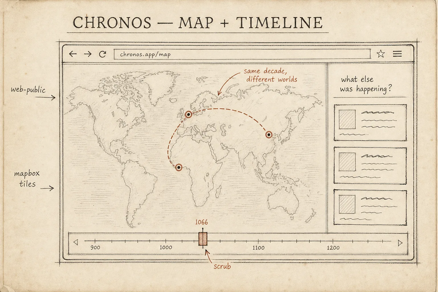
The exploration pattern the whole project exists for: pick a moment, see what else was happening, follow the connections sideways.
Architecture
The core is a temporal knowledge graph modelled inside PostgreSQL rather than in a dedicated graph database. Entities — people, places, events, polities, organisations, works, concepts, dynasties — are rows in one table; typed edges between them are rows in another, covering participation, location, causation, precedence, family relationships and positions held. On top of that sits a claims-and-evidence layer that records who asserts what.
A Python service (FastAPI) owns ingestion, search and the curation API. Background workers mine full Wikidata dumps into the graph, Redis handles caching and job queues, and PostGIS and pgvector live in the same database for geospatial queries and semantic search. Three clients sit on top — the public map-and-timeline web app, an admin app for review queues and dump management, and the mobile application — and all of them talk only to the API, never to the database, so the query patterns stay something I can change.
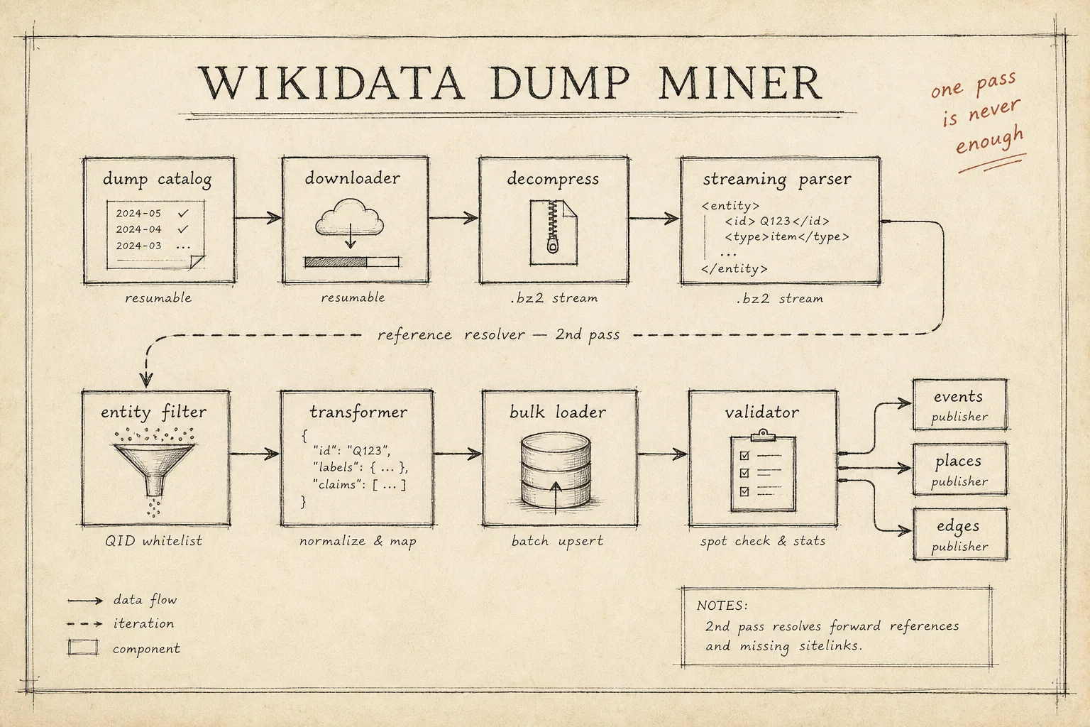
The ingestion pipeline, stage by stage. The dashed loop is the reference resolver: a second pass over the dump to pick up entities the first pass discovered it needed.
Three decisions did most of the work:
- The graph lives inside PostgreSQL. A graph database was the obvious choice and I decided against it. One store means the graph, the geospatial data and the embeddings sit side by side with one operational surface, one backup and ordinary SQL. The cost is that traversals are joins and recursive queries rather than a purpose-built query language, and I accepted that cost knowingly.
- Time lives on events, and uncertainty is part of the model. An event carries its start and end together with a precision — a known day and "some time in the eleventh century" are different values, not the same value with a footnote — and a confidence level. Both are database types, not prose. People and places get their place in time through their edges to events rather than carrying date ranges of their own.
- Every claim points at its evidence. Facts can be recorded as claims — proposed, accepted or rejected — each pointing at the source that asserts it, down to the snippet and its licence. Two sources may assert contradictory things and both claims are retained; a human decides what gets promoted into the graph, and the audit trail keeps the losing claim rather than deleting it.
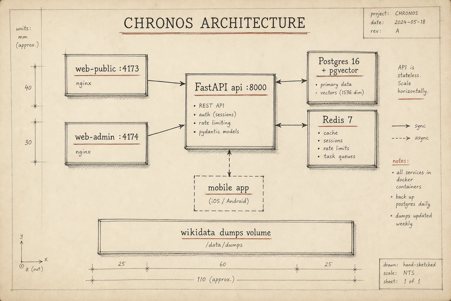
The shape of the system as it runs today: three clients in front of one API, one database, and the dump volume the miner feeds from. Drawn by hand on purpose — a sketch admits it is a simplification in a way a polished diagram does not.
Trade-offs
- Graph database versus graph-in-Postgres. A dedicated graph database would have made the deep traversals more natural. It would also have been a second store to operate, back up and keep consistent with the geospatial and vector data. I chose one database and pay for it in joins. So far the trade has held; the day a query needs six hops it may stop holding.
- Breadth versus curation. I chose to ingest Wikidata at dump scale rather than hand-curate a small region deeply. That bought coverage across the whole timeline and cost me exactly what you would expect: duplicate entities, misclassified kinds and shallow facts that need enrichment before they are worth showing. The curation tooling exists because of this choice.
- Generated narrative versus authored narrative. The system generates event overviews and story beats with a language model and stores them beside the sourced data. This is precisely the fluent-history the project was meant to be sceptical of, and I kept it anyway, because a graph you cannot read is useful to nobody. The compromise I hold to is that the graph is the source of truth and the generated prose is a view over it — but the prose is not yet derived claim-by-claim from the graph, and I am not fully happy with that.
- Focus versus following the users. The mobile application was built for following threads through history. It has since grown a museum companion: photograph an exhibit plaque, identify what you are looking at, and connect it into the graph. That is scope growth by any honest definition. I let it happen because it is the same question asked in a building instead of a browser.
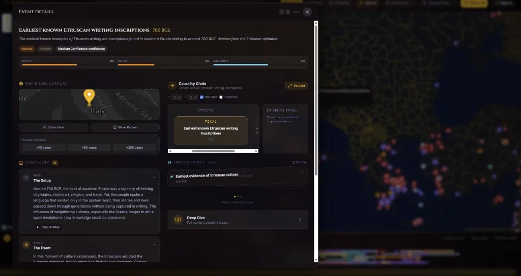
Most of the trade-offs in one screen: generated story beats on the left, the causality chain and evidence panel on the right, and a confidence badge at the top that still reads more like a caveat than a design.
What Went Wrong
My first schema stored who-was-involved as a JSON blob on each event, and stored facts as plain column values with nothing recording who asserted them. It looked fine, the API worked, and I moved on to the interesting parts feeling quite pleased.
Real data disagreed within a week. A participant list buried in JSON cannot answer "who else was at this event?" without unpacking every row, and a fact stored as a single column value means two sources asserting different dates cannot both be stored — the schema forces you to pick one and silently discard the disagreement. Once you have thrown away the disagreement between sources, you cannot show a user that historians are unsure, and the confident single value makes the system look more reliable than it is, which is the failure mode I would least want in something about history.
So one week after the first working API I wiped the core schemas and rebuilt them: participants became first-class edges in the graph, and the claims-and-evidence layer was added so that conflicting assertions are retained, attributed and reviewed rather than overwritten. The migration that did it still carries the comment "data reset is acceptable" — true only because the mistake was caught in week one. A month later it would have been a long, careful data migration instead of a reset.
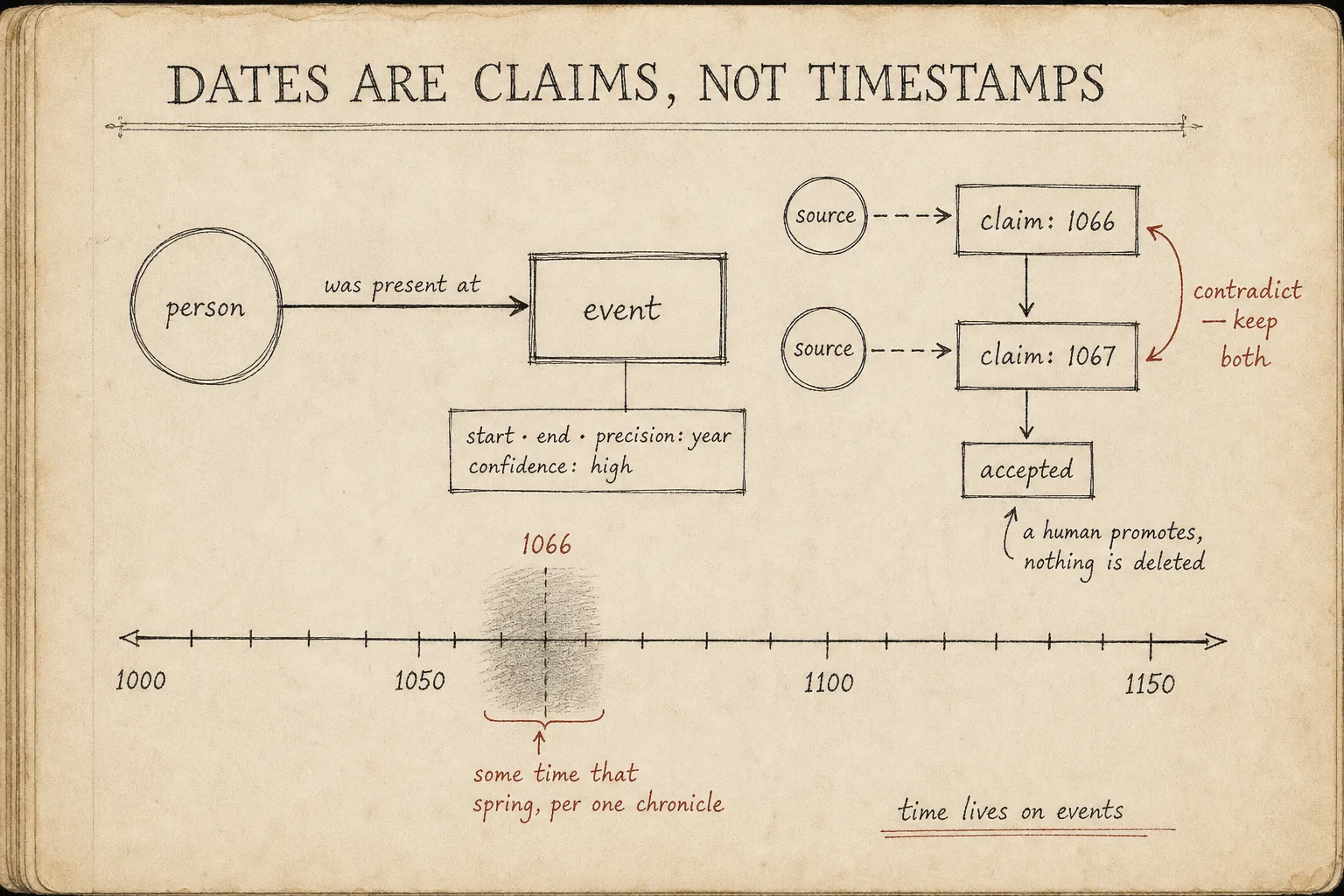
What the rebuild bought: dates carry precision and confidence, contradictory claims are both kept and attributed, and a human decides what gets promoted.
Entity resolution went wrong in a smaller, more embarrassing way. The article-harvesting pipeline creates person entities from text at the same time as the Wikidata miner imports the same people under their proper identifiers, so the graph ended up with duplicates — the same king twice under two different ids. The merge that cleaned it up matches by label alone, which is exactly the naive approach, and it runs as a previewed, human-triggered operation rather than automatically — partly by design and partly because label matching is not something I am prepared to let loose unsupervised. Entities it cannot match are flagged and wait for a human. Resolution remains semi-automatic and imperfect, and I treat its output as suggestions.
One small failure earned a permanent comment in the codebase: uploaded exhibit photographs were written into the API container's own filesystem, so every rebuild silently deleted them while the database rows survived, leaving broken links. The fix was a Docker volume and the lesson was cheap, but I documented it in the compose file itself so I stop rediscovering it.
Lessons
- The hard part of a knowledge graph is not the graph. It is deciding what the nodes are, and that decision is a domain question rather than a technical one.
- A JSON blob is where relationships go to die. If a question will ever cross a relationship, that relationship needs to be a row, not a value inside one.
- Uncertainty has to be a type in the model. If you represent doubt as prose, the first query that touches the data will discard it.
- Attaching claims to sources is not academic tidiness. It is what makes contradiction representable instead of a bug.
- When the model is wrong, rewrite it immediately. The schema reset cost a week-old dataset and nothing else; every week of delay would have raised the price.
- A system that presents a confident answer where the evidence is thin is not merely incomplete, it is misleading. That applies well beyond history.
Current State
Chronos is growing rather than finished. The PostgreSQL graph is populated from full Wikidata dumps by a resumable ingestion pipeline, the API and curation tooling work, and there are three clients: the public map-and-timeline web app, the admin app, and the mobile application, which covers both the original follow-a-thread exploration and the museum companion. Generated overviews, story beats and a conversational interface exist on top of the graph.
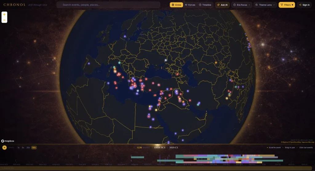
The map-and-timeline view running locally. Every marker is an event from the graph; the strip along the bottom is the whole timeline at once, which is exactly the view I could not get from eight browser tabs.
It is a personal prototype: I have not published it, I have not measured it against anyone else's needs beyond the original request, and its coverage inherits both the strengths and the gaps of Wikidata. The repository is private, largely because source licensing and attribution for the imported material still needs a proper review before any of it goes public. I am happy to walk through the model, the API and the ingestion pipeline.
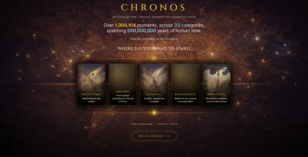
The landing page, running locally. It is worth being honest about what the counter counts: a million imported moments is a measure of ingestion, not of curation.
Next Questions
- What is the clearest single example of a connection an ordinary timeline hides? I still do not have the one demonstration that makes the whole idea obvious in ten seconds.
- How should uncertainty be shown in the interface? The model represents precision and confidence well; showing a reader that a date is a guess, without burying them in caveats, is a design problem I have not solved.
- How do I close the loop between the generated prose and the claims layer? Today the overviews are generated beside the graph rather than derived from it, which means the most readable part of the system is the least accountable part.
- Positions and reigns currently keep their date ranges in a metadata field on the edge, which is the JSON-blob mistake quietly trying to happen again. Do some relationships need first-class time after all?